The digital landscape has undergone a seismic shift. In 2026, we have officially moved beyond the era of static containers and rigid grids. Today, web design isn’t just about pixels on a screen; it’s about creating living environments that respond to the user’s intent, environment, and biology.
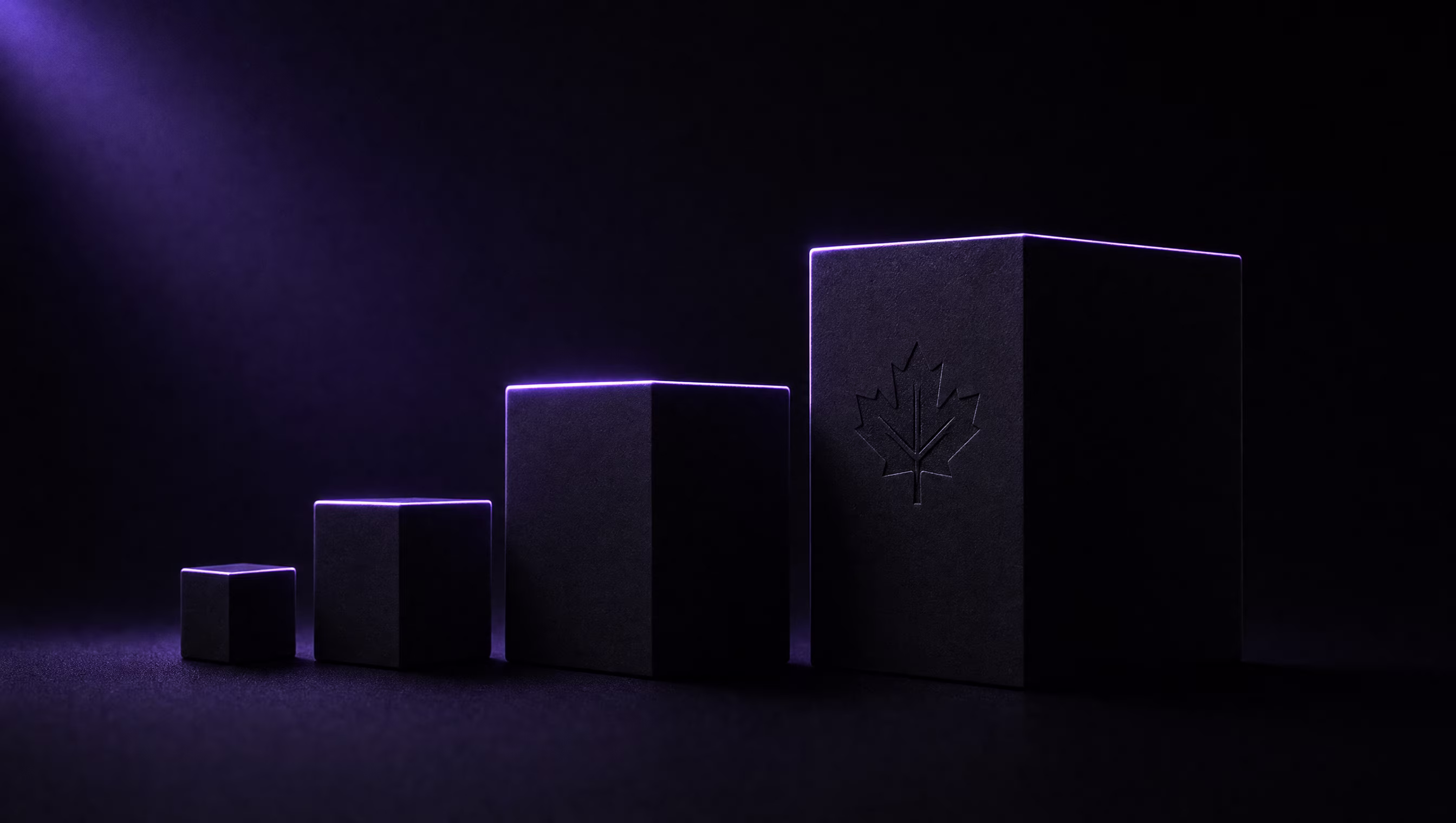
At TheBomb®, we’ve been tracking these emerging patterns across our client work - from Canadian manufacturers to national healthcare providers. Here is what is defining the cutting edge this year.
1. Spatial Computing & Depth as a Language
With the mainstream adoption of spatial computing devices and browsers, depth is no longer a visual “trick” - it is a core design language. The web has entered the third dimension.
The principles behind spatial design have roots in well-established UX research: depth perception, occlusion, and parallax have long been used to communicate hierarchy. What’s changed is the fidelity and accessibility of the tooling.
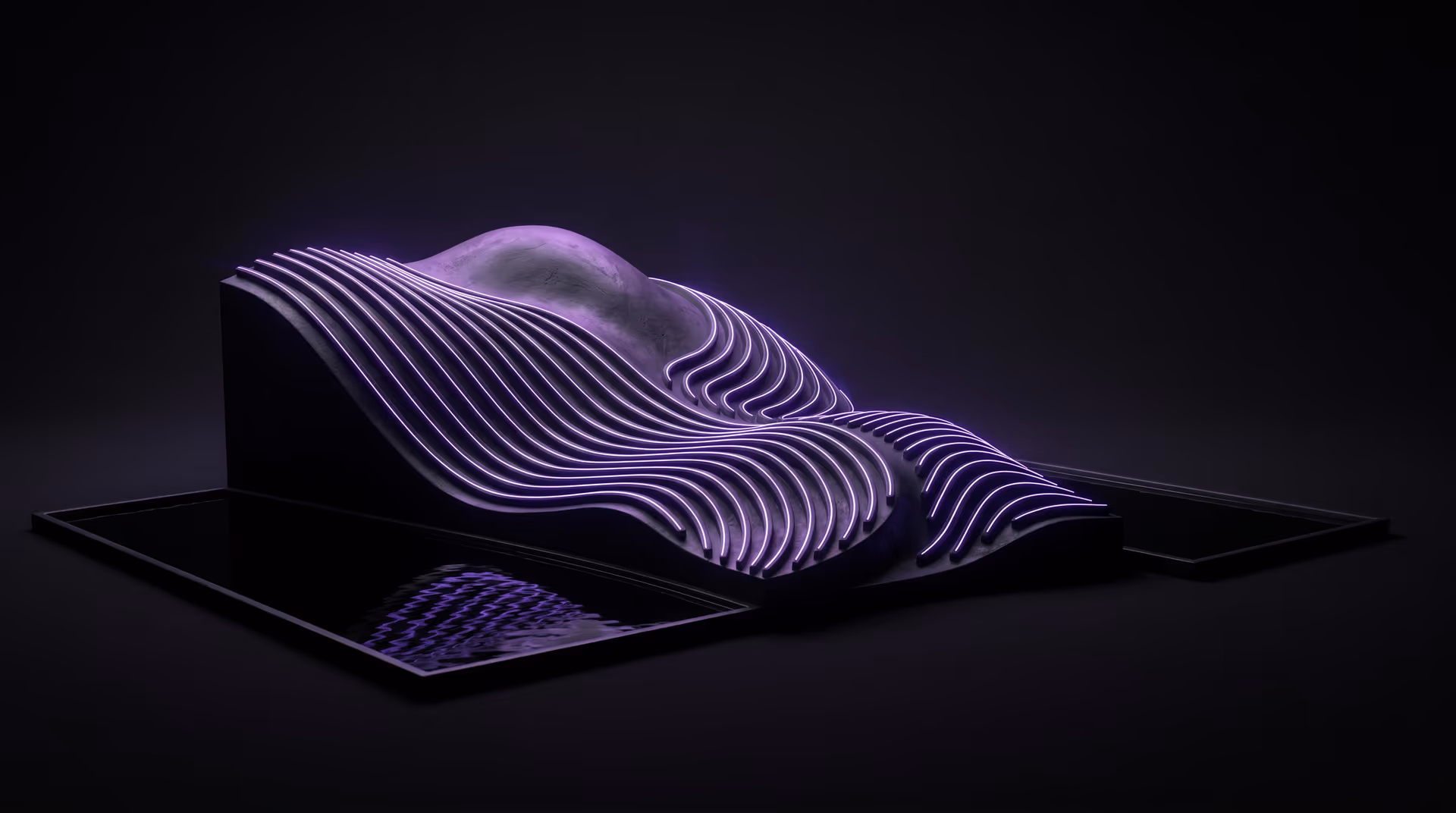
- Z-Axis Hierarchy: Instead of stacking elements vertically, forward-thinking designers are working with layered depth. Content floats in visual planes, using real-time shadows and occlusion to signal importance without relying solely on size or colour.
- Glassmorphism 2.0: The frosted-glass aesthetic first popularized in Apple’s macOS interfaces has matured. In 2026, it involves dynamic refraction and layered blur effects that respond to scroll and cursor position, creating a physical sense of depth that flat design simply cannot achieve.
- Progressive Enhancement for Spatial: Not every user has a spatial device. The best implementations degrade gracefully - delivering full 3D depth on capable hardware and a beautiful 2D experience everywhere else.
What this means for Canadian businesses
The practical application for most Canadian SMBs isn’t spatial hardware - it’s the design philosophy it represents. Using depth, layering, and blur to communicate hierarchy creates more intuitive interfaces. Navigation that “floats” above content, cards that have physical presence, modals that feel like overlaid glass - these are conversion-rate improvements, not just aesthetic choices.
2. Generative UI: The End of the “One-Size-Fits-All” Layout
Static templates are giving way to adaptive interfaces - layouts that reconfigure themselves based on context, device, behaviour, and intent.
This trend has legitimate technical grounding. CSS container queries (now supported across all major browsers as of 2023) allow components to adapt to their container’s size rather than the viewport. Combined with JavaScript-driven preference detection and personalization APIs, the “one layout for all” approach is genuinely outdated.
- Context-Aware Structuring: A user browsing technical documentation during work hours may get a dense, high-information layout. The same user on mobile in the evening may get a simplified, headline-focused summary experience.
- Adaptive Colour Systems: Modern design systems use CSS custom properties to allow real-time colour adjustments. Some implementations tie this to system preferences, time of day, or ambient conditions.
- Intent-Based Components: Predictive UI is emerging - elements surfaced based on what the user is likely to need next based on their current position in a flow. Checkout prompts, contact forms, and related content can appear contextually rather than statically.
The CSS Container Queries specification is one of the most significant layout advances in the last decade, enabling truly component-level responsiveness.
3. Kinetic Typography & Liquid Motion
Text is no longer just for reading; it’s a performance. Kinetic typography has become the standard for high-end digital brands in 2026 - and the tooling has finally caught up with the ambition.
- Variable Font Animations: Web fonts now support variable axes (weight, width, slant, optical size) that can be animated via CSS transitions. This enables responsive typography that literally responds to scroll depth, cursor position, or viewport size. The Variable Fonts specification has been stable since 2018 but is only now seeing widespread creative application.
- Scroll-Driven Transitions: The CSS Scroll-Driven Animations API (covered in our UI/UX trends piece) enables text and layout transitions that are GPU-accelerated and tightly coupled to scroll position - with zero JavaScript overhead.
- Liquid State Transitions: Page-to-page transitions using the View Transitions API allow elements to morph between states rather than cut abruptly. Astro (the framework we use for all our builds) supports View Transitions natively.
At TheBomb®, we’ve been building with View Transitions since Astro added native support in v3. The result: page transitions that feel like navigating a native app, while still using standard HTML and global edge delivery.
4. The Tactile Web: Haptic Branding
As mobile devices and haptic-enabled hardware become primary interaction surfaces, we’re seeing designers think beyond visual and auditory feedback to physical sensation.
Modern smartphones support haptic feedback via the Web Vibration API - a W3C specification that allows web pages to trigger device vibration patterns. This opens up entirely new design territory:
- A successful form submission that triggers a crisp, satisfying double-tap
- An error state that produces a grainy, uncertain texture
- Navigation interactions with subtle directional feedback
Haptic branding is still nascent on the open web, but the foundational technology is already in every smartphone. The brands that start designing with haptics now will have a distinct sensory advantage as the web catches up.
5. Neo-Minimalism vs. Digital Maximalism
We are currently living through a fascinating split in design philosophy that mirrors broader cultural tensions:
Neo-Minimalism is winning for productivity tools, SaaS dashboards, and professional services. The principle: remove everything that doesn’t directly serve the user’s primary task. Navigation is reduced to a single persistent rail. Typography is the hierarchy. White space is the design.
Digital Maximalism is dominating e-commerce, agencies, entertainment, and portfolio sites. These experiences are dense, layered, motion-rich, and immersive. They aim to communicate brand energy in the first 500ms - a timeframe well within what research identifies as the critical window for first impressions (users form initial website judgments in as little as 50 milliseconds, according to research published in Behaviour & Information Technology).
At TheBomb®, our client portfolio spans both ends of this spectrum - from the immersive, WebGL-powered Edison Motors site to the clean, conversion-focused Life Seasons Counselling portal. The correct approach depends entirely on brand positioning and user intent.
6. AI-Generated Assets & Custom Visual Languages
2026 marks the first year where most high-end studios are regularly using AI image and video generation as part of their production workflow - not as a shortcut, but as a creative tool for producing custom visual languages at scale.
Custom hero illustrations, abstract 3D renders, and bespoke iconography that would have required days of manual work can now be art-directed in hours. The competitive shift is away from stock photography (which every templated site uses) toward genuinely unique visual identities.
The critical caveat: AI-generated assets still require strong creative direction, curation, and post-processing. A brand built on undirected AI images is as generic as a brand built on Unsplash. The tool amplifies creative vision - it doesn’t replace it.
Conclusion: The Spectacular is Now Standard
The 2026 web is a place where technology and design have finally, genuinely converged. The constraints that used to force compromise - layout systems, font support, animation performance, transition fidelity - have largely dissolved.
For Canadian businesses, from Vernon to Toronto, this means the gap between “good enough” and “exceptional” has never been smaller in terms of tooling access, and never wider in terms of competitive impact. The websites that win this year are those that treat the user not as a visitor, but as a participant in a digital experience designed with the same intentionality as a physical space.
The static website is dead. The future is an interface that evolves with the user.
Ready to build what’s next?
The future isn’t something that happens to you; it’s something you build. Contact TheBomb® to start your project - let’s make it spectacular.