A Stanford Web Credibility Project study famously found that 75% of users judge a company’s credibility based on visual design alone - before they read a single word. That’s not a design opinion. That’s a ten-figure problem sitting on most homepages. Web design psychology - the discipline of aligning layout, colour, and copy with how the human brain actually works - is the difference between a site that converts and one that just exists.
Google’s own research into visual complexity and prototypicality confirmed it: users form design judgments in roughly 50 milliseconds. Fifty. That’s faster than a blink. If your hero section doesn’t pass that unconscious sniff test, nothing else on the page matters - not your copy, not your pricing, not your testimonials.
In 2026, with AI-generated sites flooding the web and attention spans compressing further, designing for the brain is no longer a nice-to-have. It’s the margin.
What Is Web Design Psychology?
Web design psychology is the applied study of how visual, spatial, and interactive design decisions trigger cognitive and emotional responses that shape user behaviour on a website. It sits at the intersection of cognitive science, behavioural economics, and UX - and its measurable output is conversion rate, time-on-task, and trust.
In practice, it means engineering four things on purpose: visual hierarchy (what the eye sees first), cognitive load (how hard the brain has to work), emotional tone (how the page makes someone feel in the first second), and behavioural nudges (the biases that push a hesitant visitor to click). Done well, the user doesn’t notice any of it - they just feel that the site “works.” Done badly, they bounce in under eight seconds and never explain why.
This isn’t guesswork. Heatmaps, eye-tracking studies, and A/B tests have mapped these patterns for two decades. The brands that win are the ones applying the research instead of arguing about logo sizes.
How Does Colour Actually Affect Conversion Rates?
Colour is the most overrated and underrated variable in design at the same time. Overrated, because “change the button to red” is the laziest CRO advice in circulation. Underrated, because contrast, semantic meaning, and emotional priming are doing real work - just not the work people think.
The research is clearer than the hot takes. A HubSpot A/B test famously found a 21% conversion lift when a green CTA was swapped for red - not because red is magic, but because the red had higher contrast against the surrounding page. The von Restorff (isolation) effect tells us that anything visually distinct from its context gets disproportionate attention. Your CTA doesn’t need to be a specific colour - it needs to be the only thing that colour on the page.
A few rules that hold up:
- Contrast beats palette. A WCAG AA-compliant contrast ratio of 4.5:1 for text isn’t just accessibility - it’s legibility, which is conversion.
- Cultural context matters. Red signals luck in China, danger in North America, and mourning in South Africa. Global sites can’t ship one palette.
- Brand consistency compounds. Signature-colour research cited by Lucidchart suggests consistent colour can lift brand recognition by up to 80% - a slow-moving conversion multiplier.
- Accessible palettes convert better because roughly 1 in 12 men is colour-blind. If your success/error states rely on green vs red alone, you’re leaking signups.
At TheBomb®, we’ve run dozens of CTA tests across Okanagan service businesses, and the pattern is boring but real: contrast and clarity win more than clever hues.
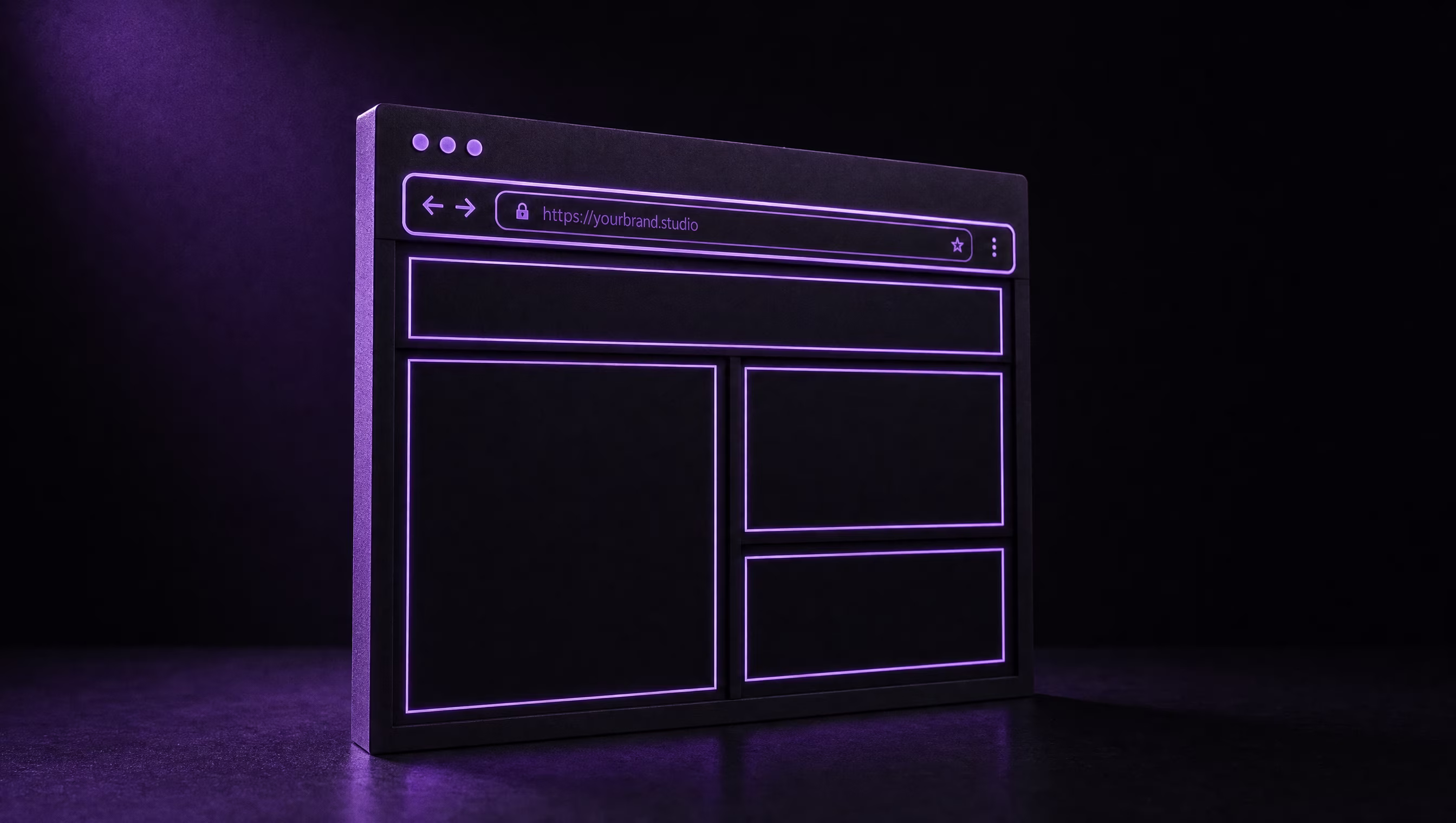
The F-Pattern and Z-Pattern - How People Read Pages
People don’t read websites. They scan them. The Nielsen Norman Group’s eye-tracking research, first published in 2006 and re-confirmed in 2017, identified the F-pattern: users’ eyes sweep horizontally across the top, then partway across a second line, then scan vertically down the left edge. The right side of the page barely gets looked at on content-heavy layouts.
The Z-pattern is its cousin for sparse, visual-first layouts - landing pages, SaaS hero sections, e-commerce tiles. The eye travels top-left → top-right → diagonally down to bottom-left → bottom-right. Every high-converting hero I’ve ever built respects this path without even thinking about it: logo top-left, nav/phone top-right, value prop + CTA bottom-left-ish, visual support on the right.
What this means for your layout:
- Put the value proposition in the top 600px. Below-the-fold hero copy is decoration.
- Front-load the first two words of headings - “Plumbing Vernon” converts better than “We offer plumbing services in Vernon.”
- Bullet lists beat paragraphs in the F-pattern’s vertical scan lane. Three bullets of six words each outperform a 40-word paragraph every time we test it.
- The bottom-right of a Z-pattern is the natural CTA resting point. That’s where the terminal click lives - respect it.
If your analytics show high bounce with high scroll depth, your F-pattern is broken. Users are looking but not finding.
Five Cognitive Biases That Drive Clicks
Behavioural economics has handed web designers a cheat sheet, mostly via Robert Cialdini’s original research on influence and Daniel Kahneman’s Nobel-winning work on judgment under uncertainty. Five biases carry most of the weight on conversion pages.
1. Anchoring. The first number a user sees sets the reference point for every number after it. That’s why SaaS pricing pages always show the “Enterprise” plan next to “Pro” - the $299 tier makes the $79 tier feel reasonable. Show your highest-value package first. Always.
2. Scarcity. “Only 2 left in stock” works because loss aversion kicks in harder than gain-seeking. Booking.com’s entire UI is a scarcity masterclass. Use it honestly - fake scarcity torches trust the moment it’s caught.
3. Social proof. Nielsen Norman Group data shows testimonials, review counts, and client logos lift perceived credibility measurably. One specific, named testimonial beats ten anonymous stars. Logo walls of real clients beat generic “trusted by thousands” copy.
4. Loss aversion. Kahneman’s finding that losses feel roughly 2x more painful than equivalent gains should rewrite most of your button copy. “Don’t miss out” outperforms “Sign up.” “Stop losing leads to slow sites” outperforms “Get a faster site.” Frame around what they’ll lose, not what they’ll gain.
5. Reciprocity. Free tools, free audits, free guides - giving something of real value before asking triggers a social obligation to return the favour. It’s why we built free tools into our SEO strategy service. Reciprocity costs you an afternoon and buys you a pipeline.
Stacking two or three of these on a single landing page is usually enough. Stacking all five starts to feel manipulative - which is the next section.
Accessibility Is Psychology, Not a Checkbox
Here’s the part most agencies get wrong: accessibility isn’t a compliance task bolted on at the end. It is applied cognitive psychology. Every WCAG guideline maps back to a known limit of human perception, attention, or memory.
- Colour contrast requirements exist because low-contrast text raises cognitive load for everyone, not just visually impaired users. Readable text = lower bounce.
- Keyboard navigation exists because motor-impaired users, power users, and anyone on a flaky trackpad on a bumpy flight all benefit. Good focus states are good UX.
- Alt text and semantic HTML aren’t just for screen readers - they’re how AI crawlers (which now drive a growing share of discovery) understand your page. Accessibility = AI SEO.
- Consistent navigation and predictable patterns reduce working memory load. That’s Miller’s Law - the brain holds roughly 7±2 items in short-term memory. Nav menus with 14 links are unreadable not because of the count, but because they blow the cache.
Accessible design converts better because accessible design is easier to use. Every time. A Forrester analysis concluded that every $1 spent on UX returns $100 - and accessibility is a disproportionate slice of that ROI.
Ethical Design vs Dark Patterns (Where the Line Is)
Persuasive design and manipulation share a toolbox. The difference is intent and transparency.
A dark pattern is a deliberately designed interface element that tricks users into actions they wouldn’t otherwise take - hidden unsubscribe links, pre-checked upsell boxes, confirm-shaming (“No thanks, I hate saving money”), roach-motel signups that are one click in and ten clicks out. The FTC has started fining companies seven and eight figures for this stuff; the FTC’s Bringing Dark Patterns to Light report laid out the categories in 2022, and enforcement has sharpened every year since.
The ethical line is simple: if the design technique would embarrass you if a user saw the wireframe, it’s a dark pattern. Scarcity is ethical when true, manipulative when fabricated. Social proof is ethical when verified, manipulative when purchased. Urgency is ethical when the deadline is real, manipulative when the countdown resets on page refresh.
In our 12+ years building sites, the short-term lift from dark patterns never outweighs the long-term cost - refund storms, chargebacks, reputational damage, and now, regulatory risk. Design for the user’s genuine interest and the conversion curve follows. Slowly, and then all at once.
Turning Psychology Into a Site That Actually Converts
You don’t need a PhD in behavioural economics. You need a site built on the research, a team that tests instead of guesses, and enough restraint to ship the boring, legible, accessible version before the clever one.
At TheBomb®, we build conversion-first sites using exactly these principles - eye-path-aware hero sections, contrast-driven CTAs, honest social proof, and accessibility baked in from the wireframe. If your current site looks nice but leaks leads, the psychology is probably the gap.
- Web design services - psychology-led design systems that convert.
- SEO strategy - because the best-designed page nobody finds is a poster in a basement.
- View our portfolio - real Okanagan businesses, real conversion lifts.
- Meet Cody New - who’s actually building the thing.
Ready to stop losing money to a pretty-but-broken site? Book a free design audit and we’ll tell you exactly where the psychology is leaking.
Key Takeaways
- Design judgments form in 50ms. Your hero section is the entire first impression - treat it that way.
- Contrast beats colour. A CTA’s job is to be the visually isolated object on the page, not a specific shade.
- Respect the F and Z patterns. Front-load value props, use bullets over paragraphs, and put the terminal CTA where the eye naturally lands.
- Stack 2–3 cognitive biases per page, honestly. Anchoring, social proof, and loss-aversion framing cover most conversion goals without crossing into dark-pattern territory.
- Accessibility is psychology. Every WCAG rule maps to a cognitive limit. Designing for accessibility is designing for conversion.