The median SaaS product converts roughly 14-25% of free trials into paid customers - and the bottom quartile sits under 8%. That gap isn’t a product problem. It’s a design problem. Your pricing page confuses people, your onboarding buries the “aha” moment behind six form fields, and your landing pages sell features instead of outcomes. SaaS web design in 2026 is the difference between a product that funds itself and a product that burns runway on paid traffic it can’t convert.
At TheBomb®, we’ve spent 12+ years building sites for B2B software, productised services, and subscription brands - and the pattern is consistent. The startups that hit 25%+ trial-to-paid conversion aren’t winning because they shipped more features. They’re winning because every pixel of the funnel - homepage, pricing, signup, first-run experience - is engineered to answer one question fast: Is this worth my time?
This guide covers the 2026 playbook. The homepage structure that sells, the pricing patterns that convert, the onboarding flow that activates in under 60 seconds, and the landing page anatomy that turns cold paid traffic into qualified trials. No theory - just what’s working right now.
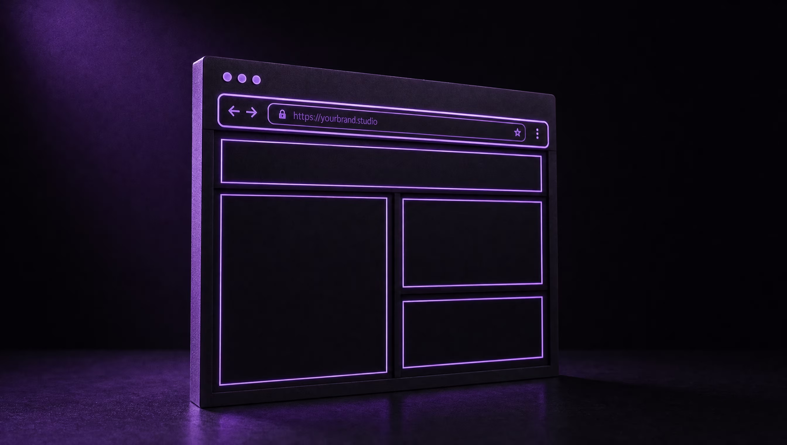
What Does a 2026 SaaS Homepage Actually Need?
A SaaS homepage in 2026 is not a brochure. It’s a qualification layer. Its job is to tell the right visitor “yes, this is for you” within 5 seconds and push them toward a trial, demo, or pricing page. Everyone else should bounce - that’s the point.
The baseline structure we use for every SaaS build:
- Hero with outcome-led headline (not feature-led). “Cut invoice processing time by 80%” beats “AI-powered invoicing platform” every time.
- Subhead that names the target user. “For finance teams at Series A-C startups.” Filtering is a feature.
- Primary CTA + secondary CTA. Primary = “Start free trial.” Secondary = “Book a demo” or “See pricing.” One button is too restrictive; three is too many.
- Social proof above the fold. Logos, review scores, or a single quantified outcome (“Used by 4,200 finance teams”).
- Product screenshot or 15-second loop showing the actual interface. Abstract 3D renders convert worse than real UI. Data from CXL’s conversion research consistently shows product imagery outperforms decoration.
- Three to five benefit blocks with micro-screenshots, not icon-and-paragraph stacks.
- Pricing preview - even a “starts at $X/mo” line cuts bounce on visitors who just want to know if they can afford it.
- Customer logos repeated near the footer CTA for anyone who scrolled past the first set.
The homepage is not where you explain every feature. It’s where you earn the click to /pricing or /signup. If you need inspiration on the visual side, our breakdown of the web design services we build around conversion covers the technical layer - Core Web Vitals, accessibility, and how the design system compounds across every page.
Pricing Page Patterns That Convert
The pricing page is the single highest-leverage page on a SaaS site. It’s where self-serve deals close, sales-assisted deals get qualified, and churning prospects get their final answer. Get it wrong and your paid traffic spend is wasted.
The anchor pattern
Show 3-4 tiers. Highlight the middle one as “Most popular” or “Recommended.” Research from ProfitWell’s pricing page analysis consistently shows the middle-tier highlight increases ACV by 10-15% through anchoring - visitors unconsciously compare against the flagship tier and feel they’re getting a deal on the middle.
The feature matrix
Below the tier cards, show a full feature comparison table. Every row is a “can I do X?” question visitors already have. Group features by outcome (e.g., “Automation,” “Reporting,” “Integrations”) - not by internal engineering categories.
The annual discount toggle
Default the toggle to annual billing, save 20% if that’s your model. Most SaaS companies leave money on the table by defaulting to monthly. According to OpenView’s SaaS pricing benchmarks, companies with annual-default pricing have 30%+ higher median LTV.
What to strip out
- Cute tier names nobody understands (“Rocket,” “Stellar,” “Cosmos”) - use “Starter,” “Growth,” “Business,” “Enterprise.”
- Hidden “Contact us” pricing on your entry tier - only your enterprise tier should gate pricing.
- Trial signup friction. If you offer a 14-day trial, the pricing page CTA should drop straight into signup, not a “learn more” detour.
Onboarding UX - The Aha Moment in Under 60 Seconds
Activation rate is the percentage of signups who reach your product’s core value event - the moment where they understand why the product matters. For Figma, it’s placing the first frame. For Calendly, it’s sharing the first booking link. For a B2B invoicing tool, it might be sending the first invoice. The faster you get users to that moment, the higher your trial-to-paid conversion.
The 2026 onboarding playbook:
- Minimum viable signup. Email + password. Period. No company name, no phone, no role dropdown. Collect that later when you’ve earned it.
- Skip the empty dashboard. Drop new users into a pre-populated demo workspace or a templated first task. Notion and Linear both do this well - you land in a live, clickable environment.
- Inline prompts, not modals. Tooltip arrows and spotlight overlays convert better than blocking modals. Modals get dismissed; inline prompts get followed.
- Progress indicator. “Step 2 of 4” beats an open-ended checklist because users know when they’re done.
- First-run email within 2 minutes. If the user bounced before activation, the email should pull them back to the specific step they abandoned - not a generic “welcome to the product.”
The north-star metric: time-to-first-value under 60 seconds. Measure it. Every friction point between signup and that first “oh, I get it” moment costs you paid conversions. Research summarised by Amplitude’s activation rate study shows a 25% relative lift in activation translates to roughly 10-15% lift in long-term retention.
How Do You Design for Both Self-Serve and Sales-Assisted?
Most SaaS companies above $2M ARR run a hybrid go-to-market - small teams self-serve via credit card, larger teams talk to sales. The web design challenge is serving both paths without making either feel like an afterthought.
Our pattern for dual-track SaaS sites:
- Two CTAs, not one. Every high-intent page (homepage, pricing, features) shows both “Start free trial” and “Book a demo.” Neither is subordinate - they’re sized and styled as peers with a clear preference (usually trial as primary, demo as secondary).
- Route by company size, not by self-identification. Ask “how many people on your team?” early. Anything under 20 goes self-serve; 20+ gets routed to a qualified demo form.
- Separate pricing pages for enterprise. Your main
/pricingpage shows self-serve tiers. A footer link goes to/enterprisewith custom pricing, security/compliance copy (SOC 2, GDPR, SSO), and a demo-only CTA. - Chat widget gated by intent. Don’t pop the chat on every visitor. Trigger it on the pricing page after 30 seconds, or on the enterprise page on any scroll past 50%.
- Sales enablement collateral as web pages, not PDFs. Case studies, ROI calculators, and security overviews should live as indexable pages - your SDRs send URLs, Google ranks the content.
If you’re running paid traffic across both tracks, pair it with our approach to PPC campaign structure for SaaS - self-serve keywords route to trial landing pages, enterprise keywords route to demo pages. Don’t send them to the same destination.
Landing Pages for Paid Traffic (Problem / Promise / Proof / Price)
Your homepage is for organic, direct, and branded traffic. Your landing pages are for paid traffic from Google, LinkedIn, and content syndication. They should be ruthlessly specific to the keyword or audience that sent the click.
The P4 structure we use for every SaaS landing page:
Problem. Open by naming the pain in the visitor’s language. Not “Enterprise-grade workflow automation” - “Your ops team still copies data between spreadsheets, and it’s costing you 15 hours a week.”
Promise. State the outcome in measurable terms. “Cut that to 30 minutes. Same team, no new hires.” Stats, percentages, and time savings beat adjectives every time.
Proof. Stack evidence in descending credibility: customer logos → named quantified case study → testimonial quote with role + company → review scores (G2, Capterra). Nielsen Norman Group’s testimonial research shows specific, quantified testimonials outperform generic praise by a wide margin.
Price. Even on a paid-traffic landing page, show a pricing preview or a direct link to /pricing. Burying price is what competitors do. Showing it early filters out bad-fit traffic and raises conversion on the good-fit segment.
Then a single, repeated CTA: “Start free trial” (or “Book a demo” for enterprise lanes). No nav, no footer links that lead off-page, no secondary offers. Landing pages are closing mechanisms - strip everything that doesn’t close.
Retention-Focused Design (Empty States, Progress, Contextual Help)
Retention starts inside the product, and product design is web design’s cousin - same principles, different surface. The patterns that keep users logged in through month two and three:
- Empty states that sell the feature. An empty project list shouldn’t say “No projects yet.” It should show a screenshot of what a fully-populated project looks like, with a button to create the first one. Empty states are onboarding.
- Progress indicators everywhere. Profile completeness, setup checklists, usage milestones. People finish what has a visible progress bar - confirmed across a decade of UX research.
- Contextual help, not a help centre dump. Inline tooltips and “Learn more” links in-product beat a standalone help site for feature-level questions. Reserve the help centre for deep tutorials.
- Notifications that earn the click. Every email and in-app alert should have a specific, actionable CTA. “Your report is ready” with a direct link beats “You have 3 updates” with a dashboard redirect.
- Re-engagement on inactivity. If a paid user hasn’t logged in for 14 days, trigger a contextual email referencing the last feature they used - not a generic “we miss you.”
Retention design compounds. A 5% improvement in monthly churn turns into double-digit LTV gains over 12 months. This is where web design meets product design, and where ongoing site and product maintenance stops being a cost line and starts being a revenue multiplier.
Build the SaaS Site Your Investors Expect
If your trial-to-paid conversion is under 15% or your activation rate is below 40%, you don’t have a product problem - you have a design problem hiding inside a product problem. Fix the funnel and the numbers move fast.
At TheBomb®, we build conversion-focused SaaS sites and landing page systems for startups and scaleups. What we help with:
- Web design & build - homepage, pricing, landing pages, and design systems engineered for trial conversion and Core Web Vitals.
- Conversion-focused paid media - paid traffic architecture that routes self-serve and enterprise lanes to the right destinations.
- SEO strategy for SaaS - keyword, content, and technical SEO plans built around buyer-intent funnels.
Ready to stop burning paid traffic on a site that doesn’t close? Talk to us about your SaaS funnel - we’ll audit your pricing page, onboarding flow, and landing page stack on a 30-minute call. See more on Cody New’s approach if you want to know who’s on the other side of the keyboard.
Key Takeaways
- Homepage is a qualifier, not a brochure. Outcome headline, target-user subhead, product screenshot, pricing preview, social proof. Anything else is decoration.
- Pricing pages convert on three patterns - anchor with a highlighted middle tier, full feature matrix below, default-to-annual toggle. Strip cute tier names and hidden entry-tier pricing.
- Activation under 60 seconds is the north star. Minimum-viable signup, pre-populated demo workspace, inline prompts, progress indicators.
- Dual-track SaaS sites route by company size, not self-identification. Two CTAs (trial + demo) as peers. Separate
/enterprisepage for deals over 20 seats. - Landing pages follow P4 - Problem, Promise, Proof, Price - stripped of nav and secondary offers. Homepage is for organic traffic; landing pages are closing mechanisms for paid.