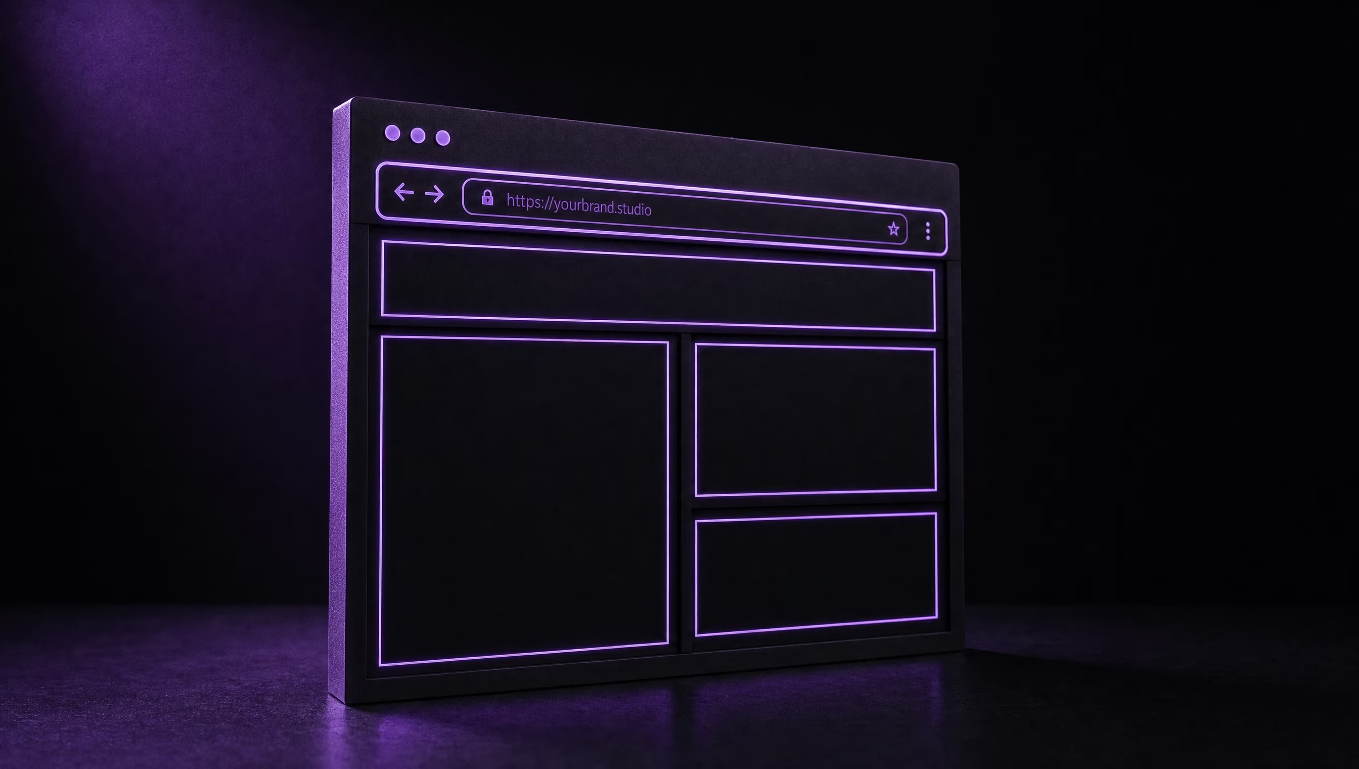


Responsive web design is a way of building a website so that one site adapts its layout to whatever screen it is viewed on. The same page rearranges itself: three columns on a desktop become one column on a phone, images scale down instead of spilling off the edge, buttons grow to fit a thumb, and menus collapse into a tap-friendly format. One website, one address, every device.
The term is often shortened to RWD, and it was coined by designer Ethan Marcotte back in 2010. Fifteen years later it is not a feature you shop for anymore. It is the baseline standard for how professional websites are built, and its absence is the fastest way to lose a mobile visitor.
How Does Responsive Web Design Actually Work?
Under the hood, a responsive site rests on three techniques working together:
- Fluid layouts. Instead of fixed pixel widths, page sections are sized in flexible units and grids, so they stretch and shrink with the browser window.
- Flexible media. Images and video are told to never exceed the width of their container, so a photo that fills a desktop column shrinks gracefully to fit a phone.
- Breakpoints. CSS media queries watch the screen width and swap layout rules at defined thresholds, called breakpoints. A grid of four cards might become two columns on a tablet and a single swipeable column on a phone.
Modern CSS has pushed this further with container queries, which let a component respond to the space it sits in rather than the whole screen, but the principle has not changed since 2010: the design responds to the device instead of demanding the device adapt to it.
Mobile-first design is the discipline that usually rides along with it. You design the phone layout first, because it is the most constrained, then enhance the layout as the screen grows. Building in that order forces the important content and the primary action, usually a call or contact button, to the front of the queue.
Responsive vs. Adaptive vs. “Mobile Site”: What Is the Difference?
Responsive is one flexible layout that fluidly adapts to any width, including ones that do not exist yet.
Adaptive design keeps several fixed layouts and serves the closest match for the detected device. It works, but every new device size means new work, which is why the industry has largely left it behind.
A separate mobile site (the old m-dot pattern, like m.example.com) is a second website maintained in parallel. It splits your search rankings across two URLs, doubles your maintenance, and Google’s own guidance has recommended responsive design over it for years.
If you are commissioning a new site in 2026 and hear anything other than “responsive,” ask why.
Why Responsive Design Matters for Your Business
Most of your visitors are already on phones. For the local service businesses we build for, mobile regularly makes up well over half of all sessions. A roofer in Nanaimo is not being compared on a desktop; the homeowner is on the couch with a phone. If they have to pinch and zoom to find your number, they tap back and call the next result.
Google indexes your mobile site, not your desktop site. Google has used mobile-first indexing for years, meaning the phone version of your pages is the version that gets crawled, evaluated, and ranked. A site that hides content or breaks on mobile is ranked on that broken experience. Responsiveness also feeds directly into Core Web Vitals, the speed and stability scores Google measures on real visits.
One site is cheaper to run than two. Every update happens once. Every URL is shareable everywhere. Every dollar of SEO effort accrues to a single address instead of being split.
Conversion lives on the small screen. Touch targets sized for thumbs, forms that do not require sideways scrolling, and a phone number that dials on tap are the difference between mobile traffic and mobile customers.
How to Tell If Your Website Is Responsive
You can check in about a minute, no tools required:
- The resize test. Open your site on a desktop and drag the browser window narrower. A responsive site reflows smoothly; a non-responsive one sprouts a horizontal scrollbar or shrinks into a miniature desktop page.
- The thumb test. On your phone, can you read the text and tap every button without zooming? Do forms fit the screen?
- The tools test. Run any page through Google’s Lighthouse (built into Chrome) and look at the mobile score, or check what real-world mobile performance looks like in Search Console.
If your site fails these, you are not looking at a tweak. Responsiveness has to be designed in, which usually means it is redesign territory rather than a patch.
Is Responsive Design Extra? What Does It Cost?
From any competent studio, nothing extra. Responsive behaviour is not a line item; it is simply how websites are built. Every site we ship at TheBomb® is designed mobile-first, tested against real phone breakpoints, and tuned so the swipe, tap, and call behaviours feel native. You can see how that plays out on real projects in our portfolio, and what it looks like as a service on our web design page.
Where cost does enter the picture is with DIY platforms: template builders advertise responsive themes, and the template itself usually is. What breaks is everything owners bolt on afterwards. If you are weighing that route, our comparison of AI website builders vs. custom web design covers where the templates hold up and where they fall down.
The Short Version
Responsive web design means one website that fits every screen: fluid layouts, flexible images, and breakpoints instead of separate mobile sites. Google ranks the mobile version of your site, your customers mostly arrive on phones, and in 2026 responsiveness is the entry fee for being taken seriously online, not a premium add-on.
If you are not sure whether your site passes, send it to us. We will tell you straight, and if it needs work, you will know exactly what kind.